
CSS Grid vs. Flexbox
Flexbox and CSS Grid are two big pieces of kit when it comes to laying out your web pages.
.jpeg&w=96&q=75)
Introduction
Flexbox and CSS Grid are two big pieces of kit when it comes to laying out your web pages.
In this article we'll look at the differences between these two page layout systems and when to choose one or the other.
As frontend developers we often use these layout systems on a daily basis, often by personal choice we choose Flexbox or CSS Grid, but in some cases one does the job easily and is the only relevant one.
In this article, I'll give examples of uses where one of the layout systems is clearly more relevant than the other.
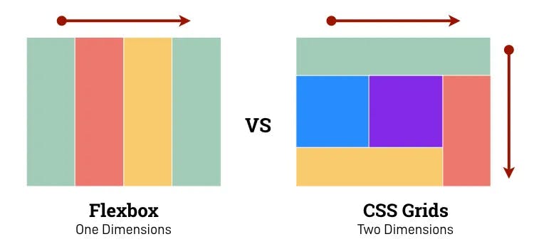
Before we start, it's important to note one key difference between Flexbox and CSS Grid. Flexbox is one-dimensional, meaning it can only be used on either the x or y axis, whereas CSS Grid is two-dimensional, allowing simultaneous use on both axes.
Let's get started!
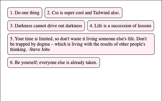
Boxes
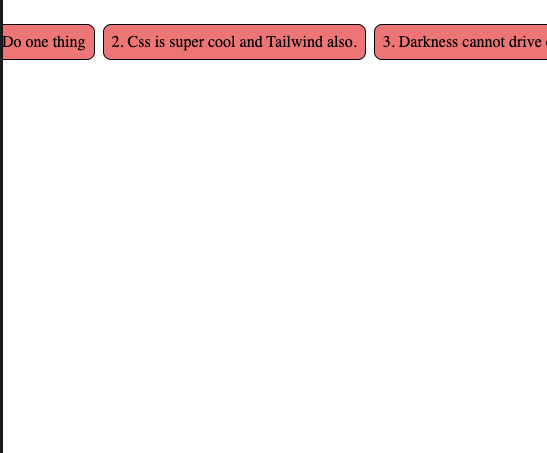
The code here is super simple, and you can see the content cascading down, filling in the blanks
<div class="flex-container">
  <div class="flex-item">1. Do one thing</div>
  <div class="flex-item">2. Css is super cool and Tailwind also.</div>
  <div class="flex-item">3. Darkness cannot drive out darkness</div>
  <div class="flex-item">4. Life is a succession of lessons</div>
  <div class="flex-item">
    5. Your time is limited, so don't waste it living someone else's life. Don't
    be trapped by dogma – which is living with the results of other people's
    thinking. -Steve Jobs
  </div>
  <div class="flex-item">6. Be yourself; everyone else is already taken.</div>
</div>
.flex-container {
  display: flex;
  flex-flow: row wrap;
  gap: 8px;
  padding: 16px;
}

.flex-item {
  border: 1px solid;
  padding: 8px;
  border-radius: 8px;
  background-color: lavenderblush;
}
Let's try to do the same thing in CSS Grid and we can see straight away how complex it is and the result isn't the same:
.grid-container {
  display: grid;
  grid-template-columns: repeat(auto-fit, minmax(200px, 1fr));
  gap: 8px;
  padding: 16px;
}

.grid-item {
  border: 1px solid;
  padding: 8px;
  border-radius: 8px;
  background-color: lavender;
}
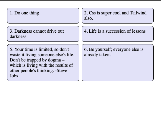
In order for the divs to span several rows, we had to define a size ourselves using minmax(200px, 1fr), which allows the CSS grid to fill both rows and columns with content.
The result we wanted was the same as for Flexbox, take the width and go back to the line if that wasn't enough.
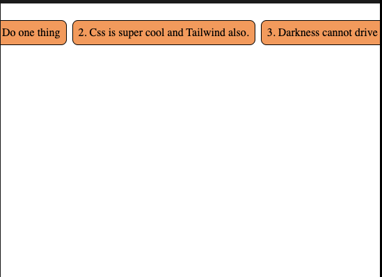
Overflow Scroll
Here what we want is for the divs to extend beyond their parents, so we want a horizontal scroll.
Flexbox
.flex-container {
  display: flex;
  flex-flow: row;
  gap: 8px;
  padding: 16px;
}

.flex-item {
  flex: 1 0 auto;
  border: 1px solid;
  padding: 8px;
  border-radius: 8px;
  background-color: sandybrown;
}
CSS Grid
.grid-container {
  display: grid;
  grid-auto-flow: column;
  grid-auto-columns: max-content;
  gap: 8px;
  padding: 16px;
}

.grid-item {
  border: 1px solid;
  padding: 8px;
  border-radius: 8px;
  background-color: lightcoral;
}
Here the situation is quite simple: the use of Flexbox or Grid is based on the preference
Box center
The most frequently asked question in CSS, how to centre a div
CSS Grid and Flexbox really make our work easier
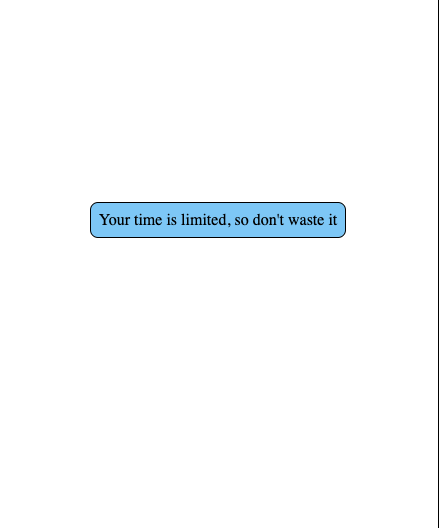
Flexbox makes it easy to center content both horizontally and vertically. Using place-content: center we have perfect centering
Flexbox
<div class="flex-container">
  <div class="flex-item">Your time is limited, so don't waste it</div>
</div>
.flex-container {
  display: flex;
  flex-flow: row wrap;
  gap: 8px;
  min-height: 100vh;
  place-content: center;
}

.flex-item {
  border: 1px solid;
  padding: 8px;
  border-radius: 8px;
  background-color: lightskyblue;
}
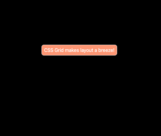
The following example shows just how simple it is to centre content using the CSS grid. It's easy to see what CSS Grid does
CSS Grid
<div class="grid-container">
  <div class="grid-item">CSS Grid makes layout a breeze!</div>
</div>
.grid-container {
  display: grid;
  gap: 8px;
  min-height: 100vh;
  place-content: center;
}

.grid-item {
  border: 1px solid;
  padding: 8px;
  border-radius: 8px;
  background-color: lightsalmon;
}
Simple layouts
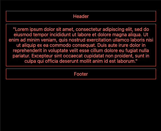
As far as simple single-column layouts are concerned, there are no major differences between the following two examples,
Flexbox
<div class="flex-container">
  <div class="flex-item">Header</div>
  <div class="flex-item">
    "Lorem ipsum dolor sit amet, consectetur adipiscing elit, sed do eiusmod
    tempor incididunt ut labore et dolore magna aliqua. Ut enim ad minim veniam,
    quis nostrud exercitation ullamco laboris nisi ut aliquip ex ea commodo
    consequat. Duis aute irure dolor in reprehenderit in voluptate velit esse
    cillum dolore eu fugiat nulla pariatur. Excepteur sint occaecat cupidatat
    non proident, sunt in culpa qui officia deserunt mollit anim id est
    laborum."
  </div>
  <div class="flex-item">Footer</div>
</div>
.flex-container {
  display: flex;
  flex-direction: column;
  padding: 36px 18px;
  gap: 8px;
  text-align: center;
}

.flex-item {
  border: 1px solid;
  padding: 8px;
}
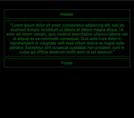
Grid
<div class="grid-container">
  <div class="grid-item">Header</div>
  <div class="grid-item">
    "Lorem ipsum dolor sit amet, consectetur adipiscing elit, sed do eiusmod
    tempor incididunt ut labore et dolore magna aliqua. Ut enim ad minim veniam,
    quis nostrud exercitation ullamco laboris nisi ut aliquip ex ea commodo
    consequat. Duis aute irure dolor in reprehenderit in voluptate velit esse
    cillum dolore eu fugiat nulla pariatur. Excepteur sint occaecat cupidatat
    non proident, sunt in culpa qui officia deserunt mollit anim id est
    laborum."
  </div>
  <div class="grid-item">Footer</div>
</div>
.grid-container {
  display: grid;
  gap: 8px;
  padding: 36px 18px;
  text-align: center;
}

.grid-item {
  border: 1px solid;
  padding: 8px;
}
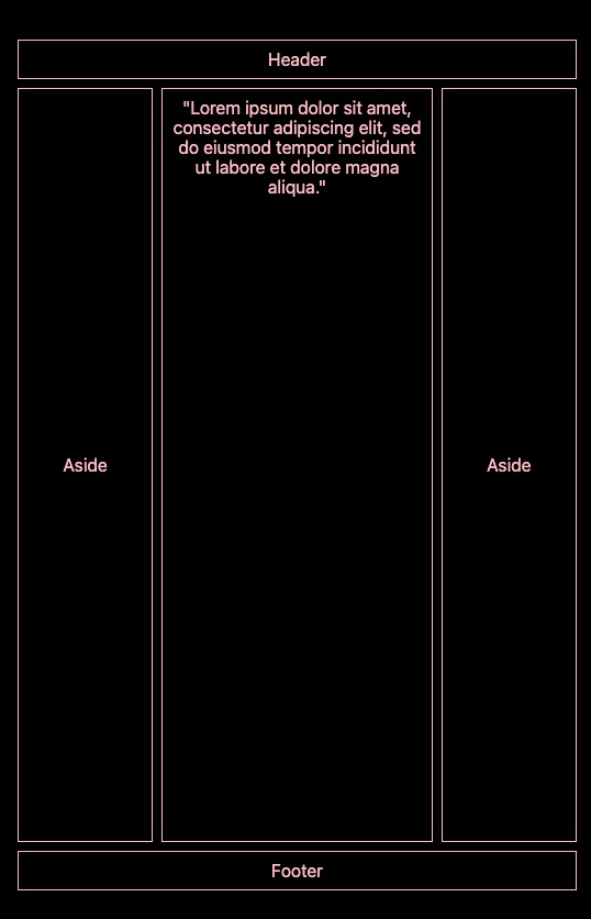
Complex layouts
Here we're going to reproduce the layout of a classic website, i.e. a navbar, two asides, main content and a footer underneath.
Flexbox
<div class="flex-container">
  <header>Header</header>
  <article>
    <aside>Aside</aside>
    <main>
      "Lorem ipsum dolor sit amet, consectetur adipiscing elit, sed do eiusmod
      tempor incididunt ut labore et dolore magna aliqua."
    </main>
    <aside>Aside</aside>
  </article>
  <footer>Footer</footer>
</div>
.flex-container {
  min-height: 100vh;
  display: flex;
  flex-direction: column;
  padding: 36px 18px;
  gap: 8px;
  text-align: center;
}

header,
footer,
aside,
main {
  border: 1px solid;
  padding: 8px;
}

main {
  flex: 2;
}

aside {
  flex: 1;
  display: flex;
  place-content: center;
  flex-direction: column;
}

article {
  flex: 1;
  display: flex;
  flex-direction: row;
  gap: 8px;
}
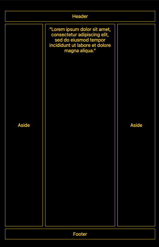
CSS Grid
<div class="grid-container">
  <header>Header</header>
  <aside>Aside</aside>
  <div class="grid-item">
    "Lorem ipsum dolor sit amet, consectetur adipiscing elit, sed do eiusmod
    tempor incididunt ut labore et dolore magna aliqua."
  </div>
  <aside>Aside</aside>
  <footer>Footer</footer>
</div>
.grid-container {
  min-height: 100vh;
  display: grid;
  gap: 8px;
  padding: 36px 18px;
  text-align: center;
  grid-template-columns: 1fr 2fr 1fr;
  grid-template-rows: auto 1fr auto;
}

.grid-container > * {
  border: 1px solid;
  padding: 8px;
}

header,
footer {
  grid-column: span 3;
}

aside {
  display: grid;
  place-content: center;
}
Conclusion
As you can see, there's not always a good match between Flexbox and CSS Grid, but some contexts force us to use one rather than the other to simplify our task.